Demography and Democracy

Yesterday’s post was about fiscal policy in China, and how difficult it is to get it just right.

Which is true enough, but Paul Krugman points out how even if China gets that bit right (and it is a big if!), it still will eventually come up against a much more intractable problem: demographics.

There’s some truth to aspects of this story, but it misses the most important factor in Japan’s relative decline: demography. Thanks to low fertility and unwillingness to accept immigrants, Japan’s working-age population has been declining quite rapidly since the mid-1990s. The only way Japan could have avoided a relative decline in the size of its economy would have been to achieve much faster growth in output per worker than other major economies, which it didn’t.

https://www.nytimes.com/2023/07/25/opinion/japan-china-economy.html

Krugman gos on to point out an underappreciated point. Relative to the troubles that Japan has gone through, it actually has not done all that badly. Far from it, in fact – it is doing rather well, relative to expectations:

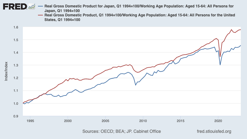
By the way, if you’re unfamiliar with FRED St Louis, this would be a fun assignment to get you going. Try and recreate this chart by yourself.

So what worked with Japan? Paul Krugman hypothesizes that this may be due to Japanese society being dynamic and culturally creative. I haven’t been to Japan so far, but I cannot wait to go. Next year, fingers crossed.

But the obvious question, of course is whether China in the near future can manage what Japan did over the last thirty years. Paul Krugman thinks not:

Yet if China is headed for an economic slowdown, the interesting question is whether it can replicate Japan’s social cohesion — its ability to manage slower growth without mass suffering or social instability. I am very definitely not a China expert, but is there any indication that China, especially under an erratic authoritarian regime, is capable of pulling this off? Note that China already has much higher youth unemployment than Japan ever did. So, no, China isn’t likely to be the next Japan, economically speaking. It’s probably going to be worse.

https://www.nytimes.com/2023/07/25/opinion/japan-china-economy.html

Yesterday’s post was about problems in the near term for China. Today’s post is about long term problems in the case of Japan, and how they’ve dealt with it. Both perspectives are important, and if you are a student of economics, both really and truly matter:

I often begin introductory classes in macroeconomics by saying that there’s two reasons you might want to take your child to a doctor. I should know, I have a five year old daughter.
The first reason is because the child has a cold say, or a fever. A temporary problem, that can hopefully be fixed in the “short run”. The other reason that you might want to take your child to a doctor is to figure out if your child is doing well on parameters such as height, weight etc. Any parent who has agonized over what percentile their child is on that accursed chart which shows “normal” height and weight knows what I’m talking about. These are “long run” parameters.
The economy is the same! We worry about short run problems, such as the deficit, or the annual budget, and well we should. But we should also be thinking long and hard about the long term growth prospects of our children economy.

https://atomic-temporary-112243906.wpcomstaging.com/2018/10/09/links-for-9th-october-2018-aka-the-nobel-special/

Note to readers: if you’re wondering why “democracy” in the title, ponder this phrase from Paul Krugman’s post: “especially under an erratic authoritarian regime”. Democracy may give you slow growth, but it is underrated, especially in today’s day and age.

Note to self: that five year old daughter will be ten years old next month! Where did time go?!

Learn Macro by Reading the Paper

Macro, and I’ve said this before, is hard.

But a useful way to start understanding it, at least in an Indian context, is by:

  • carefully reading a well written article
  • understanding and noting for oneself key concepts within that article
  • recreating the charts from that article
    • That includes figuring out the source of the data…
    • … as well as acquiring the ability to build out these charts
  • And most important of all, creating a piece of your own (could be a YouTube video/short, a blog, an Instagram story, a Twitter thread) that helps simplify the article you’ve read.((Skipping this last point is missing the point altogether, rascalla!))

Now, Arvind Subramanian and Josh Felman have generously obliged us by writing a well written article. I’ll oblige you by carefully reading it and annotating it, including pointing out key concepts, sources for data and recommendations for building out the charts.

That just leaves the last point for you, dear reader. We’ll call that homework.

Now, the well written article:

For more than a decade, India’s fiscal problem has been on the back-burner, acknowledged as a concern, but excluded from the ranks of pressing issues. Now, however, the problem is back with a vengeance. COVID has upended the fiscal position, and fixing it will require considerable time and effort, even if the economy recovers. This worrisome prospect has prompted calls for the Fiscal Responsibility and Budget Management Act (FRBM) to be dusted off, reintroduced, and implemented — this time, strictly and faithfully. But before we heed them, we need to understand why the previous FRBM strategy failed and how to prevent a repeat. We argue below that the new strategy will look nothing like the current FRBM.

https://indianexpress.com/article/opinion/columns/coronanvirus-india-economy-gdp-growth-post-covid-7261915/

First things first, what is FRBM?

The Fiscal Responsibility and Budget Management Act, 2003 (FRBMA) is an Act of the Parliament of India to institutionalize financial discipline, reduce India’s fiscal deficit, improve macroeconomic management and the overall management of the public funds by moving towards a balanced budget and strengthen fiscal prudence. The main purpose was to eliminate revenue deficit of the country (building revenue surplus thereafter) and bring down the fiscal deficit to a manageable 3% of the GDP by March 2008.

https://en.wikipedia.org/wiki/Fiscal_Responsibility_and_Budget_Management_Act,_2003

Think of it as a one-person Alcoholic’s Anonymous club. It is of the government, for the government and by the government, and the idea is to wean the government off a dangerous addiction that it is hopelessly affixed to: debt.


By the way, there are many reasons this is a good essay, not the least of which is how well structured it is. The first three sentences in the very first paragraph, excerpted above, point out the problem that is going to be addressed, without using any difficult words or jargon. Then they point out the tool that will be used to address the problem. Then they point out the tool itself has problems. Finally, the explain that the essay is about fixing those problems. And then the essay follows. You might want to keep this in mind when writing your own essays (or indeed creating your own podcasts/videos etc.)


Now, back to the essay:

  1. What is general government debt? Where can I access the data?
    Note the second hyperlink above: I’ve linked to the Fred St Louis page about India’s debt, which itself gets the data from the IMF. Here is the page from the Ministry of Finance’s own website titled Public Finance Statistics. It has not been updated since September 2015. Here is a Motilal Oswal report on the subject that pegs general government debt at INR 157,227 billion. (Exhibit 1 in the report). If you read footnote 3 of that exhibit, two things happen. The first thing that happens is that you realize that tracking down general government debt might take a while. The second thing that happens is you feel a rather large twinge of sympathy for the folks who have tried to do this exercise.
    Figure 1 in the well-written article that we are analyzing in today’s post doesn’t mention a source, unfortunately. So recreating that chart will involve a rather large part of our day – but I would strongly recommend that you do the exercise. If you want to analyze Indian macroeconomic data for a living, this will be a good initiation. And indeed, a write-up about this exercise alone is a worthy addition to your CV!
  2. Second r-g: what is r, and what is g?
    1. “r” is the policy rate, which in our case will be the repo rate. This is available on the homepage of the RBI, top-left, under current rates.
    2. Time series data? Available on the DBIE page, under key rates.
    3. “g” is the nominal growth rate of the economy, and can be found at MOSPI.
    4. A useful thing to do as a student is to try and recreate the chart in the well-written article.
    5. Pts 1 and 2 here will help you get most of the data, and try and use either Microsoft Excel or Datawrapper to recreate the chart.((Document your learnings as you go along.))
  3. Next, what is primary balance?((Read the whole article, please. It’s a good way to clear your understanding of this topic, and it is free)) Where does one get that data in India?((The Excel link under Deficit Statistics was down when I tried to access the data. Your mileage may vary.))
  4. Next, this sentence from the article: “Simple fiscal arithmetic shows that debt does not explode when the former (primary balance) is greater than the latter (interest-growth differential)”. What is this “simple fiscal arithmetic”? They’ve explained it in equations 1 and 2 in this paper.((Page 3))
  5. The next three paragraphs after Figure 1 in the article point out how precarious India’s situation is when it comes to government debt, and why. It is one thing to read about the equation in a textbook, it is quite another to “run” the numbers in practice. Give it a shot, please, and see if it makes sense.
  6. Next, this paragraph from the article:
    “First, India should abandon multiple fiscal criteria for guiding fiscal policy. The current FRBM sets targets for the overall deficit, the revenue deficit and debt. This proliferation of targets impedes the objective of ensuring sustainability, since the targets can conflict with each other, creating confusion about which one to follow and thereby obfuscating accountability.”
    This paragraph is a good way to understand the importance of reading In The Service of the Republic, by Kelkar and Shah (and also to read up about the Tinbergen Rule).
  7. The next three paragraphs after that are a good way to understand what Goodhart’s Law means in practice.
  8. And finally, see if you can explain to yourself why targeting the primary balance is better than other options. Personally, I agree that it is a better target, and I agree that rather than setting down a concrete number to reach, averaging out half a percentage point worth of reduction is better. In essence, what they’re saying is that you shouldn’t try to reach x kilos of weight on a diet, but lose x% body weight every month. As our ex-captain might have put it, process over results. One of our gods advocates this too, as Navin Kabra points out.
    My reservation comes from the fact that sticking to a diet is hard, and that is true whether you’re targeting a process or a target. In other words, it is the ongoing implementation of the plan that is the challenge, not it’s design!
  9. One last point: without creating something that you are willing to put up for public consumption, and highlighting on your CV as an exercise you have done – you haven’t really learnt. Reading either that article or this blog is the easy part – explaining it somebody else is the much more difficult (and causally speaking, therefore meaningful) bit.
  10. Please, do it!

Playing Around With Data

In yesterday’s post, I spoke about collection, and a teeny-tiny bit about the history of the institutions behind data collection exercises in India.((Really teeny-tiny bit. Please read the whole thing))

In today’s post, I’ll compare two websites – one American and one Indian – to show you how both countries allow researchers to use the data that has been collected. Spoiler alert: the American website does a way better job. The idea isn’t to run down the Indian website, but to see how much distance we need to cover in terms of improvement.

And I think it is a worthwhile question to ask – why is the American website so much better? What is it about us that we cannot come up with a website of a similar quality? Is it a question of capacity, of bureaucratic inertia, of not enough demand from the research community in India or something else altogether? This is a topic worth thinking about… but not today.


The American website is FRED, hosted by the St Louis branch of the Federal Reserve. FRED stands for Federal Reserve Economic Data, and it is a magnificent resource. It really and truly is.

Federal Reserve Economic Data (FRED) is a database maintained by the Research division of the Federal Reserve Bank of St. Louis that has more than 765,000 economic time series from 96 sources. The data can be viewed in graphical and text form or downloaded for import to a database or spreadsheet, and viewed on mobile devices. They cover banking, business/fiscal, consumer price indexes, employment and population, exchange rates, gross domestic product, interest rates, monetary aggregates, producer price indexes, reserves and monetary base, U.S. trade and international transactions, and U.S. financial data. The time series are compiled by the Federal Reserve and many are collected from government agencies such as the U.S. Census and the Bureau of Labor Statistics.

The economic data published on FRED are widely reported in the media and play a key role in financial markets. In a 2012 Business Insider article titled “The Most Amazing Economics Website in the World”, Joe Weisenthal quoted Paul Krugman as saying: “I think just about everyone doing short-order research — trying to make sense of economic issues in more or less real time — has become a FRED fanatic.”

https://en.wikipedia.org/wiki/Federal_Reserve_Economic_Data

I’ve been using the website for years now in classes that I teach, but I’m sure there are features of the website that I have not been able to use. It’s got the ability to create charts on the fly, it has embeddable widgets, it even has a functional Excel add-in.

If you’re looking at this website for the first time, try going through these exercises. Or, if you are a video kind of person, try this playlist on YouTube.

It is, all things considered, a wonderful way to take a look at data – mostly American, naturally, but it does have a whole host of other data series as well.


The Indian website is our comparable offering: the database on the Indian economy. As you will see once you click on the link, it isn’t nearly as user-friendly as FRED, and in my experience, the website itself isn’t always “up” all the time. There isn’t, to the best of my knowledge, a YouTube channel that explains how to use the website, and while there is a brochure about DBIE, it isn’t quite as helpful as it ought to be.

Indian researchers will also visit the MOSPI website often. That is the Ministry of Statistics and Programme Implementation. If you read the link supplied in the first footnote of today’s blogpost, you will know that MOSPI is the culmination of India’s data collection exercises – these have been ongoing since at least 1881.

The MOSPI website itself is a bit problematic, because there are two now. One is mospi.nic.in, which is the one I have linked to above, and the other is mospi.gov.in. This one seems to not be fully functional just yet, and the data is far from complete. Gratifyingly, what little data there is on the new website is made available in Excel formats.

That is actually a major problem, because on the old (but current, if you see what I mean) MOSPI, data is given in PDF format. There is an army of Indian researchers who have fought the Great PDF Wars, as a consequence, and therefore have learnt about Chrome extensions, and about Tabula. If you are planning on researching the Indian economy, you will have to acquire these skills sooner or later, for MOSPI and DBIE are the best we have on offer in terms of data portals((that are free and government run. There are other data portals available, but of course one must pay for them)).


I said I won’t speak about the “why” regarding data portal quality, but I would like to offer a suggestion about the “how” in terms of improving it.

Appoint an educational institute to be the nodal agency((IGIDR would be a good pick for obvious reasons)), and get them to work on a report about what needs to change, and why and how, for the DBIE website to become better than it is right now. That doesn’t mean (at all) a blind copy of FRED, awesome though FRED definitely is.

And if the team that does end up working on this is also allowed to come up with a beta version of the new website, well, that would just be the proverbial cherry on top.

I mean, why not?