Here’s the excellent Our World In Data page about the topic, and here’s a lovely visualization of how the TFR has changed for the world and for India over time (please make sure to “play” the animation):
(I hope this renders on your screens the way it is supposed to. If not, my apologies, and please click here instead)
But now we have news: India’s TFR has now slipped below the replacement rate. Here’s Vivek Kaul in Livemint explaining what this means:
The recently released National Family Health Survey (NFHS-5) of 2019-2021 shows why. As per the survey, India’s total fertility rate now stands at 2. It was 3.2 at the turn of the century and 2.2 in 2015-2016, when the last such survey was done. This means that, on average, 100 women had 320 children during their child-bearing years (aged 15-49). It fell to 220 and now stands at 200. Hence, India’s fertility rate is already lower than the replacement level of 2.1. If, on average, 100 women have 210 children during their childbearing years and this continues over the decades, the population of a country eventually stabilizes. The additional fraction of 0.1 essentially accounts for females who die before reaching child-bearing age.
Of course, as with all averages, so also with this one: you can weave many different stories based on how you slice the data. You can slice it by urban/rural divides, you can slice it by states, you can slice it by level of education, you can slice it by religion – and each of these throws up a different point of view and a different story.
But there are three important things (to me) that are worth noting:
The TFR for India has not just come down over time, but has slipped below the global TFR in recent years.
This doesn’t (yet) mean that India’s population will start to come down right away, and that for a variety of reasons. As Vivek Kaul puts it: “So, what does this mean? Will the Indian population start stabilizing immediately? The answer is no. This is primarily because the number of women who will keep entering child-bearing age will grow for a while, simply because of higher fertility rates in the past. Also, with access to better medical facilities, people will live longer. Hence, India’s population will start stabilizing in around three decades.”
The next three to four decades is a period of “never again” high growth opportunity for India, because never again (in all probability) will we ever have a young, growing population.
Demography is a subject you need to be more familiar with, and if you haven’t already, please begin with Our World in Data’s page on the topic, and especially spend time over the section titled “What explains the change in the number of children women have?”
Noah Smith had a rather exasperated blogpost (or newsletter post) out recently about Jason Hickel.
Hickel, an anthropologist by training, has two major theses about the world:
He believes that global poverty reduction is a myth, and He believes that degrowth is the best solution to environmental problems. Both theses are wrong. And not just wrong in the “Ackshually, sir, you don’t have the facts quite right” sense, but wrong in consequential, potentially dangerous ways. In this post I’m only going to push back against the first of these two narratives; I promise I will write more about degrowth later, and in the meantime you can read this and this.
What Roser’s numbers actually reveal is that the world went from a situation where most of humanity had no need of money at all to one where today most of humanity struggles to survive on extremely small amounts of money. The graph casts this as a decline in poverty, but in reality what was going on was a process of dispossession that bulldozed people into the capitalist labour system, during the enclosure movements in Europe and the colonisation of the global south. Prior to colonisation, most people lived in subsistence economies where they enjoyed access to abundant commons – land, water, forests, livestock and robust systems of sharing and reciprocity. They had little if any money, but then they didn’t need it in order to live well – so it makes little sense to claim that they were poor. This way of life was violently destroyed by colonisers who forced people off the land and into European-owned mines, factories and plantations, where they were paid paltry wages for work they never wanted to do in the first place.
I honestly don’t know where to begin in terms of refuting just this excerpt, let alone the rest of the essay, but thankfully, I don’t really need to. Noah Smith takes on part of the burden in his essay already, and Max Roser also pads up in this essay:
You can see this more clearly in the chart below. Clicking on the ‘relative’ button shifts the chart from absolute numbers to percentages. Whilst the proportion of the world’s population living in extreme poverty has been falling consistently since 1820, it is only in recent decades that this has translated into a decline in the number of people living in extreme poverty.
The chart above is absolute numbers, while the one below is in percentage terms. Both charts are from the essay by Roser linked to above. Here is the link again.
Look, much remains to be done in our battle with poverty. Much, much more. The fight is nowhere close to finishing, and we still aren’t sure about how to best reduce poverty – and by we I mean even the best of economists, no matter how you measure “best”. But this fact is incontestable: the world is better off today than it was a century ago, and that by various measures. One of which is the fact that poverty levels are down. By how much, by which yardstick, for which country and why – all are questions worthy of debate. Your answer about the magnitude of reduction in absolute levels of poverty might differ from mine, as might your choice of poverty line. It might also differ in terms of proximate cause.
But not the direction. Your answer about the direction when it comes to reduction of poverty ought to be the same: lower.
Anybody who has been subjected to an introductory econ class by me has inevitably been through this:
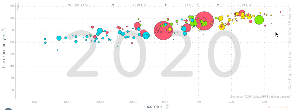
I’ve been talking about Gapminder in my classes for over a decade now, and have written about it on these pages a number of times. I’m still to come even remotely close to being bored: it is simply that good. But today, I want to point out a feature of this graph that is a nice way to get started on thinking about economic growth.
As I always say when I introduce Gapminder to students for the first time, this is what Hans Rosling((legend. Absolute legend.)) used to call the “Health and Wealth” chart – for obvious reasons. This is the crucial bit though: there is no country that is towards the top left of this chart, and there is no country that is towards the bottom right.
Rich countries – that is, countries with high GDP per capita – have better health outcomes. Poor countries – that is, countries with lower GDP per capita – have worse health outcomes. Yes, we are measuring health through only one parameter, and yes we can never be sure in what direction the causality runs((it runs both ways, but you get to say that only after many years of kadi tapasya)) – all that I’ll happily concede. But still, richer countries have better health outcomes. I’m, as they say, willing to die on this hill.
Growth matters.
Growth, or GDP per capita, or material well-being – I’ll conflate these terms and give textbook authors a heart attack in the process – they aren’t an end in and of itself. They’re the means to achieving ends: health, education being just two of them.
And yes, growth comes at a cost, and there are problems with growth – many, many problems. But still.
Growth matters.
And as I mentioned in yesterday’s post, Lant Pritchett is a bhakt when it comes to worshipping growth:
Broad-based growth, defined as the process that raises median income, is far and away the most important source of poverty reduction. There is no instance of a country achieving a headcount poverty rate below 1/3 of its population (at moderate poverty line of $5.50) without achieving the median consumption of that of Mexico. This is not to say that there do not exist anti-poverty programs that are cost-effective and hence should be expanded, or, conversely, that there are anti-poverty programs that are not cost-effective (or even have zero impact on poverty) and should be cut back or eliminated. Analyses of these types of programs would enable a more efficient use of resources devoted to poverty reduction. But large and sustained improvements in global poverty will almost certainly have to focus on how to raise the productivity of the typical person in a poor country, which is a key source of national income growth.
Pritchett’s fervent defense of the idea of worshipping growth stems from two places. One, as a worthy idea in and of itself, but more so because he thinks that development economists have lost their way a little bit:
The only solution to world poverty is vast increases in the productivity per person which would be the result of sustained economic growth that is broadly shared and increases in national development. This is going to require the answers to many complex and interesting questions, and research into those questions is, to my mind, the domain of development scholarship. And, when national development is achieved the kinky development agenda is (nearly) completely solved through general social progress.
(By the way, this article carries my all-time-favorite title ever.)
He is saying, in plain simple English, that growth is what matters. Everything else that is currently going on in development economics is secondary.
Growth matters.
And as one might anticipate by now, Gulzar Natarajan agrees:
I am strongly inclined to argue that foreign aid should be confined to either development of pure physical infrastructure or for R&D or for state capacity building and should avoid advocating or supporting specific social development programs in areas like health, education, nutrition, agriculture etc. As I will try to explain, there is something about social development programs that demands that these societies struggle hard on their own to make difficult collective social and political choices.
If Kenya needs to fix its school education system, its stakeholders need to grapple with the real reasons why children are not attending schools, why teachers are not accountable, why the quality of instruction is so poor, and prioritise resource allocation and make political choices accordingly. There is a path dependency associated with reaching the destination. Technical solutions are a diversion from the real task. For example, take the issue of teachers accountability to the parents. A biometric attendance solution is a good innovation but in a complex system can at best offer the illusion accountability and that too for a short-time, while also postponing the imperative to undertake the reforms like making the school and teachers accountable to the local community.
What he is really saying is that Goodhart’s law is a real problem, and we should cut to the chase and focus on the real, underlying problem, rather than chase relatively easily measurable metrics.
That is, getting teachers to punch in on time is no guarantee that they’ll teach well, much like getting students to attend classes is no guarantee that they’ll learn well. But making attendance mandatory, and measuring it, gives us the satisfaction of Having Done Something.
But the point of getting education “right” is to make people more productive. The point of getting education “right” is not to have teachers (or students) turn up on time!
And the point of helping folks become more productive is, as always the fact that:
Growth matters.((In the post coming up on Monday, I’ll review a book that helps us understand why))
That was a question sent in by a student recently, and today’s essay is an attempt to answer the question.
Have you heard of the tsetse fly? Unless you are a student of biology, or from Africa, it is unlikely that you have. And there’s no reason for you to have heard of it, of course. On the other hand, if you were to be from Africa, and from a long time ago, you likely would not only have heard of the tsetse fly, but you would have dreaded it.
Why would you have dreaded it? Because the tsetse fly feeds on the blood of vertebrate animals, and in doing so, also manages to transmit diseases between species. And this fly was so very efficient at transmitting diseases that it actually prevented the emergence of animal husbandry in those parts of Africa where it was both present and dominant.
Worse: research has established that the existence of the tsetse fly in certain parts of Africa has at least partially contributed to those parts of Africa remaining relatively underdeveloped today.
Ethnic groups inhabiting TseTse-suitable areas were less likely to use domesticated animals and the plow, less likely to be politically centralized, and had a lower population density. These correlations are not found in the tropics outside of Africa, where the fly does not exist. The evidence suggests current economic performance is affected by the TseTse through the channel of precolonial political centralization.
That’s what development economists do: they try and figure out which parts of the world are not doing well. Then they try and figure out why (imagine being able to identify a fly as a potential cause of underdevelopment!). And finally, they try to recommend policies that might make the situation better.
Three Big Questions
When I teach courses in development economics, I often introduce the subject by speaking about three “big picture” questions:
What does the world look like?
Why does it look the way it does?
What can we do to make it better?
And honestly, that is really all you need to think about when you want to understand what development economists do. Let’s tackle each of these questions in turn.
What does the world look like?
Good development economists don’t begin with recommendations and policy measures. That’s a long way down the road. They begin by trying to paint for themselves a picture of the world.
My favorite way to paint for myself a picture of the world is by using a freely available online tool called Gapminder.
What are we looking at? Hans Rosling, the Genius (I don’t use the word lightly, and the capitalized G is intentional) who came up with this tool, used to call this chart the “Health and Wealth” chart.
Well, here’s what it tells me – see if you agree with my understanding. It tells me that the reason economists harp on so about increasing income (GDP) for all nations is not because getting rich is an end in and of itself. It is the means to an end – that end in this case being better health.
Two caveats: higher life expectancy doesn’t necessarily mean better health. But in this case, I think it is an acceptable proxy. Second, correlation is not necessarily causation! Higher wealth may not necessarily be causing better health. Maybe better health is causing higher wealth? Maybe some other variable is causing both of these things? Maybe it is all of these and more?
But all those caveats aside, at first glance, a basic fact emerges:
There is no country that is at the top left of this chart, and there is no country at the bottom right of this chart.
Poor countries tend to not do well in terms of life expectancy, and rich countries tend to do well in terms of life expectancy. If I want the members of my family to live longer, I would want my country to be towards the top right of this chart.
But back to the central question: what does the world look like? This is a generalization, of course, but most of the African nations tend to lie towards the bottom left. Most of the European nations tend to lie towards the top right. And Asian nations (and some South American nations) tend to lie somewhere in the middle.
That’s one answer to the question we were trying to answer in this section: what does the world look like?
But there are other answer possible! Here are just two to get you started:
Play around with the World Bank Atlas, a most excellent data repository.
Why does the world look the way it does?
The Magic That Happens When You Hit Play in Gapminder
I have been using Gapminder for over 12 years now, but I am yet to get tired of watching that video. In fact, as I often tell my students, you could do a lot worse than spending time with Gapminder open in one tab, and Wikipedia in the other.
(On a tangential note, take a look at what happened to the world between 1918 and 1921. That’s the Spanish flu at work.)
Why did I include this video in this blogpost?
Because it helps us begin to think about the answer to the second question: why does the world look the way it does?
The world looks the way it does today because some countries were able to steal a march on others about two hundred years ago. The United Kingdom, the United States of America, Japan, Germany and some other nations started moving towards the right top of the chart before other countries could. You could, in fact, make an argument these countries were able to move to the right top by making sure that the other countries stayed at the bottom left!
And when you make that argument, you begin to try and answer the second question – this argument is the anti-imperialist stance. The Asian and African colonies of the European powers of the 19th century lag behind as much as they do today because they were colonies: that’s one candidate for explaining why the world looks the way it does.
The tse-tse fly (remember?) is another candidate for a more localized answer to the second question. Politics, race, religion, geography, caste, gender, openness to innovation – there are so, so many candidate answers! People can (and do!) spend entire careers making their way through just one of these candidates.
By the way, if you would like to read books about this topic – why does the world look like the way it does – here are two absolute must-reads:
I’m not joking! That was a genuine proposal, made by this guy who you may have heard of. Started a software firm, dabbled in philanthropy, and is now engaged in trying to literally save the world. Yes: Bill Gates. His master plan to save Africa involved giving everybody a chicken.
Our foundation is betting on chickens. Alongside partners throughout sub-Saharan Africa, we are working to create sustainable market systems for poultry. It’s especially important for these systems to make sure farmers can buy birds that have been properly vaccinated and are well suited to the local growing conditions. Our goal: to eventually help 30 percent of the rural families in sub-Saharan Africa raise improved breeds of vaccinated chickens, up from just 5 percent now. When I was growing up, chickens weren’t something you studied, they were something you made silly jokes about. It has been eye-opening for me to learn what a difference they can make in the fight against poverty. It sounds funny, but I mean it when I say that I am excited about chickens.
Well, I exaggerate, of course. Not literally giving everybody in Africa a chicken – but something along those lines.
Development economists were less than impressed:
But first, let’s talk about poultry. I think we can agree that we can only give away so many chickens. You’ve said that a family that receives five hens could eventually earn $1,000 annually, assuming a per-bird price of $5. But would that still be true when a third of your neighbors are in the same business? As supply goes up, I’d expect the price and profits to come down. And moving to an economy in which 30 percent of rural Africans sell chickens is a humongous increase in supply.
And to make matters worse, other development economists were less than impressed with the development economists who were less than impressed with Bill Gates’ chickens:
I have friends/alumni/colleagues working around the world in many facets of the challenge of development. I have friends working for the Prime Minister of India. I have friends working for the President of Indonesia. I have friends working on the conflict in Yemen. I have friends working as civil society activists in Egypt. I have had policy discussions with policy makers all over the world. I worked for 15 years in the World Bank. I have taught development at Harvard for 15 years. In all of those conversations with friends, colleagues, policy makers, and students all kinds of difficult and pressing development questions have arisen that research could address. Never, ever, ever has “chickens versus cash” arisen as an issue at all, much less as the remotely possible “best investment” in research.
By the way, that blog post that I quoted above? It has possibly my all time favorite title ever: Getting Kinky with Chickens.
Why am I telling you all this? Because allow me to let you in on a dirty little secret: there is zero consensus on what is the correct answer to the third question.
Well, OK, zero consensus is an exaggeration. But it ain’t a settled issue, no sir.
That is, nobody has come up with a definitive, one-size-fits-all answer to the question, “What can we do to make the world better?”
Let’s parse through the question. That might help us understand why it is such a controversial one.
What can we do to make the world better?
Who, exactly, is “we”? That is, who is in charge of decision making when it comes to making things better? Do democracies work better? Or do autocracies? Or something in between? Remember, we are not asking which political system is the best from a moral, or political, perspective. We are asking which system is likely to give us the most rapid growth. Was Singapore under Lee Kuan Yew a true, participatory democracy, or was it a democracy with Asian characteristics? What about South Korea under General Park? And while we’re on the subject, an autocracy is not by itself a guarantee of rapid growth! Pakistan, Cambodia are two examples from our own neighborhood. Also remember: just because a system may give us more rapid economic growth doesn’t mean it is the best system to use. China is the obvious country to think about in this regard!
Do we really need to “do” stuff, or is it more about just getting out of the way, and letting the economy work it’s magic?
Chart from a lecture I'm giving: how migration replaced aid as a development program pic.twitter.com/KRa7FlhRal
3. Are we agreed on what “better” means? Lesser pollution comes at the cost of lesser industrialization, for example. Are we so sure that all seven billion of us can identify the exact point on the spectrum that works best? And if not, then we’re back to the first point: who is “we”?
And hey, even if you could imagine a world in which we somehow, magically get everybody to agree on “What can we do to make the world a better place?”, we’d begin a new round of battles, centered around a new question.
Still, there is some good news. The unsettled nature of the debate means that this is extremely fertile ground to work upon, and you can count on development economics as a field remaining a fundamentally interesting one to work in for years, if not decades, to come.
And that, my friend(s), is what development economics is all about!