A Tale of Two Charts

On Tuesday, I’d put up a post about Claudia Goldin having been awarded the Nobel Prize.

The original post did not have a chart at the start, it had a verbal description of a table from a rather-boring-to-read-but-oh-so-important PDF. A friend to whom I had sent the post for review suggested that a chart might do a better job instead. He was right, of course, and so I went ahead and added a chart. Here it is:

Here is the same data, but shown in a different way:

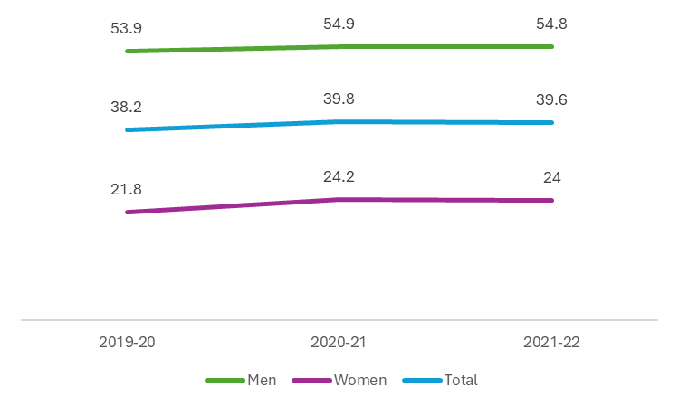
Which chart tells a better story?


Chart design and visualization is a subject that has long fascinated me. How long? 16 years, to be precise. One of my managers, back when I was a corporate employee, had taken a chart I had created, and shared it with the whole team. Which in and of itself was fine – but he had then also recreated my chart, but with his ideas for how to make it better. Placed next to each other, they showed pretty much the same thing – but in the same way that a stick figure and the statue of David are the same thing.

Now, I am nowhere close to being an expert when it comes to charts, but ever since that day, I have been fascinated by how powerful a well designed chart can be. Powerful in terms of it being a clear way to tell a story, it being a simple way to tell a story – and how much detail can be fitted into a single chart.

But for today’s post, let us focus on clarity and simplicity. Which of these two charts tells a simple, clear story? Would it be the one that I had in the post, or the second one?

  1. How do I want to group the data? Categories (men, women and total) on the axis, or time on the axis?
    What story do I want to tell? Do I want to emphasize how much the data has changed over time, or do I want to make the point that women’s participation has always been lower than that of men (and of course therefore the total)?
  2. Should I use bar charts, or should I use a line chart?
    The answer to this question depends on the answer to the first question. If I want to emphasize how much the data has changed over time, it should be a line chart. If I want to emphasize the fact that women’s participation is always lower, I should use a grouped bar chart. But what if the line chart actually makes this point even more clearly?
  3. Which color scheme is better?
    Again, do I want to emphasize the difference between the categories? Or do I wish to emphasize the change over time. In my opinion, the second chart looks cleaner, and tells a simpler story.
  4. Note that the second chart doesn’t have a reference scale, but the first one does (the “x-axis” with the numbers running from 0 to 60).
    And therefore, to me, the second chart is better in this regard. It has less information that needs to be processed by the viewer, and they can reach a conclusion rather more quickly.
  5. Do data labels help or hinder?
    In my opinion, they help. In fact, well designed data labels take away the need for a reference scale, and so can help make the chart look cleaner.
  6. What about chart titles?
    Ideally, each chart should have a title, that answers the TMKK question. I didn’t include titles in either case because it was a blog post and not a presentation – but I know I would have got a metaphorical rap on the knuckles. When you create a chart, also create a useful title is a good rule to follow. So follow what I say, not what I do!

There are lots of good resources to follow online if you want to get better at using data visualization to tell better stories. Stephen Few, Edward Tufte, Jan Schultink and Nancy Duarte are just four names to get you started – but these four will teach you much more than you will need. And if you poke around in the alleys and bylanes of this part of the internet, you will be able to find so much more.

But please, do learn the art of data visualization, it is quite a powerful tool to have in your arsenal. And if you think the first chart is better than the second one, please let me know why – because I think the second chart wins hands down.

Excel and Me

I’ll soon be teaching a bunch of students Microsoft Excel. This has been true every year that I’ve been a teacher, but in this case, it’ll be students who:

  1. Are not all that familiar with English
  2. Are not from an urban background

Which is a fun, exciting challenge, and I cannot wait to get started.

As part of preparing for this course, we’re asking folks to fill out a form about their usage of Microsoft Excel. You don’t have to, of course, but if you feel like helping out, you can fill said form here. But designing this form made me reflect on how I have used Microsoft Excel over the years.

  1. I started my career in analytics, building out predictive models for two firms based out of Bangalore. This involved high-falutin’ statistical packages (for the time), but about 75% of the work involved working in Microsoft Excel. I realized (very and painfully) quickly that I hadn’t learned enough about Microsoft Excel in college. But the good news was that Excel was incredibly simple to learn, and the payoffs were (and continue to be) huge.
  2. I then registered for a PhD, and the model that I built for my thesis was entirely in MS Excel. I used other statistical software to test the model and run a couple of additional statistical tests, but the model itself? MS-Excel.
  3. I worked for about five years in the renewable energy industry, first as a consultant and then as a full time employee, but interest rate forecasting, exchange rate forecasting, oil price forecasting was a major chunk of what I did. But in addition, researching about climate change was also part and parcel of the job. Each of these required the creation of a mind-numbing variety of charts, tables, and pivot tables, and Excel was always on the work menu.
  4. And since 2013, I have taught for a living. Not only have I taught at least one course around MS-Excel every single year, but I have also used MS-Excel in ways which ended up being a lot of fun. We built an attendance system using Google Sheets, for example, and I cannot tell you how much fun it was. But we also taught sampling distributions and the central limit theorem using Google Sheets, and so many other things.

So: it hasn’t mattered whether I’ve worked in the analytics industry, the renewables energy industry or in academia. Excel, or spreadsheet software more generally speaking, has been an indispensable part of my work life.

And in addition, I use spreadsheet software to track my invoices, track our household budget, and to track our financial portfolio. I’d probably depress myself out of wanting to work if I used it to track my productivity (or lack of it), but I assure you, this can be done too.

Long story short: get busy learning MS Excel (or a substitute) if you are in college right now. There’s no end of learning material that is easily available online, and if you need any help, please, feel free to teach out!

ashish at econforeverybody dot com

PSA: XLOOKUP for the win

Any student who has been subjected to an Excel class by me knows the syntax for VLOOKUP, because it just is that awesome (and mundane) a formula. When you type in “=VLOOKUP(” in a cell in Excel, Excel asks you four questions:

  1. What should I look for?
  2. Where should I look for it?
  3. Once I find it, which column’s entry matters to you in this row?
  4. Do you want an exact match, or will an approximate match do?
https://exceljet.net/excel-functions/excel-vlookup-function

If you haven’t used VLOOKUP before, I strongly urge you to both (pun half intended) look it up, and try it for yourself. Here’s a simple explainer from Microsoft.

But gawd, XLOOKUP is so much better!

Use the XLOOKUP function to find things in a table or range by row. For example, look up the price of an automotive part by the part number, or find an employee name based on their employee ID. With XLOOKUP, you can look in one column for a search term and return a result from the same row in another column, regardless of which side the return column is on.

https://support.microsoft.com/en-us/office/xlookup-function-b7fd680e-6d10-43e6-84f9-88eae8bf5929

If you’ve used VLOOKUP in the past, that last bit, after the comma, is likely to bring a tear to your eye. It is available only in Office 365 (which, in my opinion, is entirely worth the price of entry) or MS Office 2021, please note.

Here’s the legendary Chandoo explaining how to go about using it:

Elementary, My Dear Excel

This broke my heart:

But some researchers are calling Ariely’s large body of work into question after a 17 August blog post revealed that fabricated data underlie part of a high-profile 2012 paper about dishonesty that he co-wrote. None of the five study authors disputes that fabrication occurred, but Ariely’s colleagues have washed their hands of responsibility for it. Ariely acknowledges that only he had handled the earliest known version of the data file, which contained the fabrications.
Ariely emphatically denies making up the data, however, and says he quickly brought the matter to the attention of Duke’s Office of Scientific Integrity. (The university declined to say whether it is investigating Ariely.) The data were collected by an insurance company, Ariely says, but he no longer has records of interactions with it that could reveal where things went awry. “I wish I had a good story,” Ariely told Science. “And I just don’t.”

https://www.sciencemag.org/news/2021/08/fraudulent-data-set-raise-questions-about-superstar-honesty-researcher

I’ve been recommending Dan Ariely’s books and talks to students for years now, and with good reason. But whether he himself was responsible for this, or not, it is certainly the case that a thorough investigation is warranted, both of this specific paper, but also of his entire body of work.


But the point of this post isn’t to just point out this rather depressing fact. The blogpost that broke the story is worth reading in full for the following reasons:

  1. The admirable clarity in how it is written. Anybody who knows the very basics of math and statistics (and I do mean the very basics) will be able to understand what is going on.
  2. You don’t need to know any coding to figure out how they uncovered the fraud. Simple Excel is enough.
  3. The researchers have provided the data for you to play along with as you read the blogpost.

So if you are a student of statistics (and that is all of us, like it or not), I’d strongly encourage you to set aside a couple of hours, and work your way through the post and the Excel file(s).


And finally, a word of advice if you are a student who is just about beginning to play around with data:

  1. Don’t commit fraud. It sounds stupid, almost, to dispense this advice, but please, resist the temptation.
  2. Double check data that has been sent to you by somebody else. Triple check it! And checking means running sanity checks. There is still a chance that you will not be able to detect fraud, if it has been committed, but minimize the chances. Get better at asking questions of the data you are working with!
  3. Stuff like this is, trust me on this, the best way to learn statistics. No amount of end-of-chapter problem solving will help you get your basics clear like a statistical whodunnit. Or a what-was-done, as in this case.

A lengthy excerpt, but a necessary one. What follows are the last three paragraphs of the blogpost that broke this story:

We have worked on enough fraud cases in the last decade to know that scientific fraud is more common than is convenient to believe, and that it does not happen only on the periphery of science. Addressing the problem of scientific fraud should not be left to a few anonymous (and fed up and frightened) whistleblowers and some (fed up and frightened) bloggers to root out. The consequences of fraud are experienced collectively, so eliminating it should be a collective endeavor. What can everyone do?
There will never be a perfect solution, but there is an obvious step to take: Data should be posted. The fabrication in this paper was discovered because the data were posted. If more data were posted, fraud would be easier to catch. And if fraud is easier to catch, some potential fraudsters may be more reluctant to do it. Other disciplines are already doing this. For example, many top economics journals require authors to post their raw data [16]. There is really no excuse. All of our journals should require data posting.
Until that day comes, all of us have a role to play. As authors (and co-authors), we should always make all of our data publicly available. And as editors and reviewers, we can ask for data during the review process, or turn down requests to review papers that do not make their data available. A field that ignores the problem of fraud, or pretends that it does not exist, risks losing its credibility. And deservedly so.

https://datacolada.org/98

If you’re writing a paper, put your data up for public scrutiny. Always, and without fail. It matters.

Links for 12th March, 2019

  1. “We have a limit, a very discouraging, humiliating limit: death. That’s why we like all the things that we assume have no limits and, therefore, no end. It’s a way of escaping thoughts about death. We like lists because we don’t want to die.”
    Umberto Eco on an exhibition that he is going to have at the Louvre… on lists. He explains why he likes the idea of lists so much – and says it’s not just him. Listicles are as old as humanity, and are around because we want to make the infinite understandable.
  2. “The drama started earlier this week, when Warner “revoked a previously agreed-upon publishing license” for India, according to Spotify, “for reasons wholly unrelated to Spotify’s launch in India.” Existing global deals don’t cover expansions into new territories, so when Spotify enters a country like India, it has to make a separate deal. With Warner pulling out, Spotify attempted to side-step a direct deal with the label using a controversial amendment in Indian law, which says “broadcasters” can obtain a license for copyrighted works even if the copyright owner denies use. In response, Warner fired back with a request for an injunction, forcing the case to the Indian court system.”
    I have subscribed to the service, and am quite happy with it so far. I also subscribe to Google Play music, but find Spotify’s playlists better organised, especially be genre. Google Play Music, as I see it, has two advantages: it allows you to upload up to 50 GB of your own songs to it’s servers, and you can then play them from anywhere. Second, it has the WB catalog – which Spotify doesn’t, and this article explains why.
  3. “Using the Excel app, you can take a picture of a printed data table on your Android device and automatically convert the picture into a fully editable table in Excel. This new image recognition functionality eliminates the need for you to manually enter hardcopy data. This capability is starting to roll out for the Excel Android app with iOS support coming soon.”
    I have tried it, and it works – albeit imperfectly. But if you have ever struggled with the beast that is MOSPI – or anything like it, this is likely bring a tear to your eye.
  4. “I think we’re at the point of no return. The omnichannel train has left the station. What would I do if I ran a retail business today? First, I would accept the fact that customers now love to shop both online and offline, and they expect two-day shipping for certain products and near flawless execution. The bar has been set high by Amazon. Then I would create a game plan that leverages my existing physical assets like warehouses, distribution centers and stores to offer new services like ship-from-store or pickup-at-store. I would also build new fulfillment centers specifically to fulfill online orders and ship to customers’ homes.”
    More useful for the infographic atop the excerpt above. The fourth section of the infographic is a mix of optimism and handwaving to me – unless you replace the word “will” by “should”. Also see the Stratechery article about value chains.
  5. “It is worth noting that individual citizens of some of the world’s most volatile regions have asked WMI for cloud seeding services. A growing body of research addresses the idea that many wars and conflicts are stoked by environmental problems, which are often underlain by weather problems. Increasing drought across north-central Africa has ruined crops, starved the populace and is thought to have enabled Al Qaeda in the Islamic Maghreb’s invasion of northern Mali in 2012. A paper published earlier this year in the Proceedings of the National Academy of Sciences journal stated that drought in Syria between 2007 and 2010 was the worst since instrumental record-keeping began, and caused widespread crop failure, mass migration and helped spark the Syrian conflict.”
    A Longread article on cloud seeding or “weather mod”. Worth it to understand what technology optimism means in practice, and to understand how long the attempted history of weather modification has been, and also for the photographs. For the photographs, I would recommend viewing this on the desktop.